Design
July 29, 2026
What Makes a Website Feel Premium? 7 Design Principles
A premium website is not defined by flashy effects. Learn the seven design principles that make digital experiences feel clear, credible, and valuable.


A premium website is not defined by flashy effects. Learn the seven design principles that make digital experiences feel clear, credible, and valuable.
A premium website is easy to recognize, but surprisingly difficult to define. It feels considered. The layout has confidence. The content is easy to follow, and every interaction seems intentional.
That feeling does not come from adding more effects, expensive photography, or oversized typography. It comes from making hundreds of small design decisions work together.
Premium design is not about making a website look expensive. It is about making every detail feel deliberate.
Here are seven principles we use to create digital experiences that feel polished without becoming excessive.
Visitors should understand what matters within seconds. Strong hierarchy guides the eye from the main message to supporting information and then to the next action.
That means using size, spacing, contrast, and placement with discipline. If everything is large, bold, or animated, nothing feels important.
A premium interface feels calm because it makes decisions for the visitor.
Whitespace is not unused space. It gives content room to breathe and helps people understand which elements belong together.
Consistent spacing also communicates precision. When margins, gaps, and section rhythms change without a reason, the site feels assembled rather than designed.
The goal is not to make every section enormous. The goal is to create a predictable visual rhythm that supports the story.
Typography often contributes more to perceived quality than imagery. A thoughtful type system gives the brand a recognizable voice while keeping long-form content comfortable to read.
A strong system normally needs fewer choices, not more:
Premium typography feels distinctive without making the reader work.
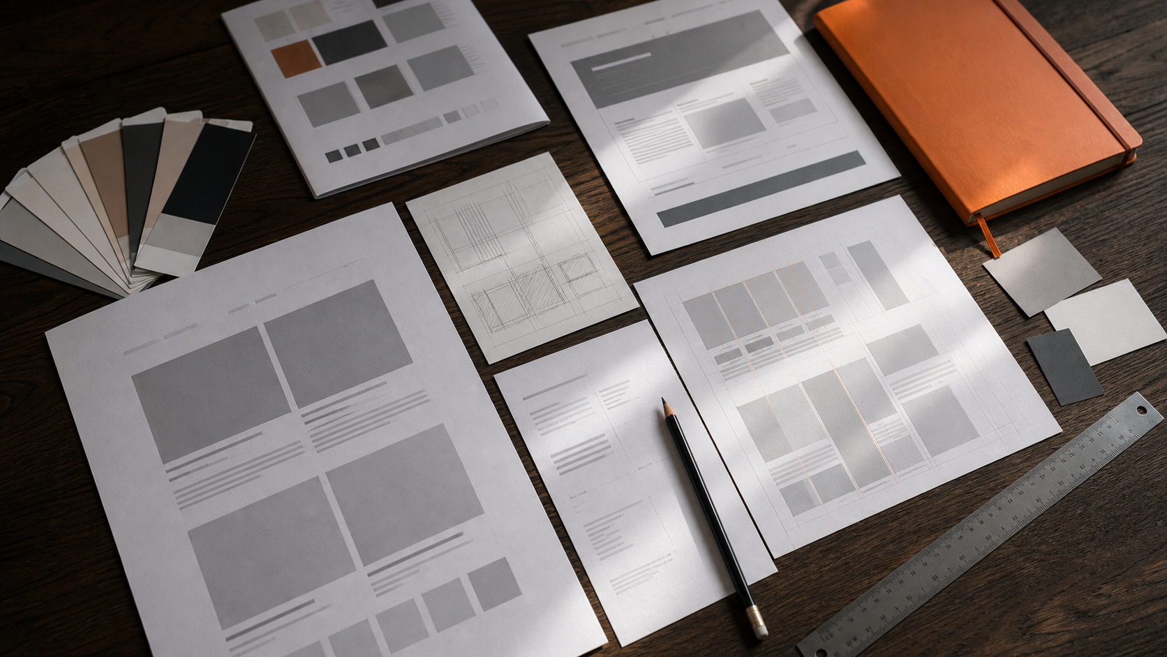
Designing with generic copy often produces generic layouts. Real headlines, real product benefits, and realistic calls to action reveal what the page actually needs.
Content-first design also reduces last-minute compromises. The interface is built around the message instead of forcing the message into a visual template.
Color and animation are most effective when they have a job. A restrained palette makes important accents more powerful. Purposeful motion can explain a transition, show cause and effect, or direct attention.
Animation that exists only to prove that a website can move usually adds friction. Premium experiences use motion selectively and respect visitors who prefer reduced motion.
A beautiful homepage cannot compensate for inconsistent service pages, forms, or mobile layouts. Quality is judged across the full experience.
Reusable components and clear design rules help maintain the same level of polish everywhere:
Consistency builds familiarity, and familiarity builds trust.
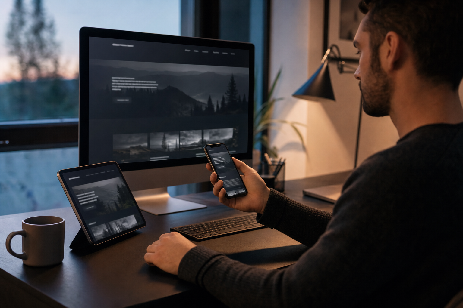
The most valuable details are often invisible: readable contrast, clear form labels, useful error messages, fast-loading images, visible focus states, and responsive tap targets.
These decisions may not appear in a design showcase, but they determine whether the site feels dependable in real use.
Premium design is the result of clarity, restraint, consistency, and care. It should help a business communicate its value - not distract visitors from it.
Cyberhawk creates digital experiences where brand, content, interaction, and development work as one system. If your current website feels inconsistent or no longer reflects the quality of your business, tell us what you want to improve.

